“Once upon a time, a palm reader said that I was fickle minded and had an innate hunger for power. Duh, I’m a woman, hello?”
Okay, so I’ve got too much time in hand and decided to fiddle with my blog banner. Again. Urm, sorry.
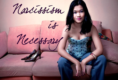
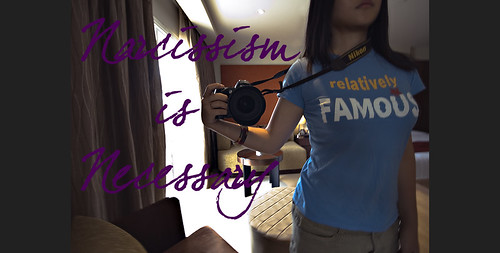
Which is your favourite?
#1

#2

#3

Love to hear your thoughts on these banners. My favourite is #3 obviously because I’m using it.
By the way, I’ve set up a page to archive all my FHM articles here. I’ll only publish them after the latest edition has come out but still, don’t wait till I publish here to read lor…must support ya :)
number 2 matches the title of the blog better
Actually, i like #3. Though i have to admit #1 kinda grew on me, still getting used to new banner.
i like #1 because the colour matches the blog.And the big words are so cool.
but #3 is nice too.
i like #3 best
I like the #2 !
i love the current one you’re using! The colour balance is perfect albeit the sky being corrected to a slightly purplish hue. but contrasts well. this must have been taken in england?
Number 3 is my favorite … The concept of number 1 is good, but if you can change a bit your attire, then would be great .. how about an elegant dress :P
paul: yeah..the mirror and the t-shirt is pretty spot on heh
janus: that’s great..thanks :)
grace: tq! was afraid the yellow fonts would be rather funny.
vampirem: cool. more the reason to leave it be then heh
dave: yeah it does seem to fit the blog title more!
choco: thank you :D yeah it was taken in a lil town called broadway.
hn: hehe i got the message! :P
d current one is nice! very creative! n this grey background doesnt hurt d eye as bad as d black one did
Oooh, I like this new one best. The first one, yr facial expression not OOMPH enuf :P Dunno why but I like the way the yellow lines are emphasized in the 3rd pic. Keep this one!
Definitely #3!
I picked #2 :)
#3!
Number 3 easily. :-)
#3 is nice but might be abit too cliche?
#3 is the best. it got so much depth in the pics
#3. :) I think the font is put at just the right place.
chumi: always been this grey wor. maybe the previous banners made it looked black heheh
whimsicaljottings: i totally agree. thanks! :D
eiling: thanks woman :D
pauline: i wish i could use them all interchangeably haha thanks!
da: thanks! :D
dabs: thank yous! :)
ky: not as cliche as black and white street photography!
khaichung: thank you! :)
david: thanks man :D
#3!
definitely #3
I find in all your pics, you’re always trying to show your BOOBS! Hahahaha….nice boobs! :-P
number 3!! eh what time of day was it? why are the skies purple..
gwen & kuan: thanks! :)
brandy: hahah “all” is a bit of a blanket statement eh? but thanks! :P
pinkpau: it’s purple becoz i photoshop, n00b!
3!
although sick bastard me certainly miss the earlier cleavage, but have to give way for professionalism, this banner is very nice. i would say best so far.
#2. Liked the shirt
My fav is #3 too. Love the purple sky.
I like ur header. Very down to earth.
I like no. 3!
3 is unique